South Block.
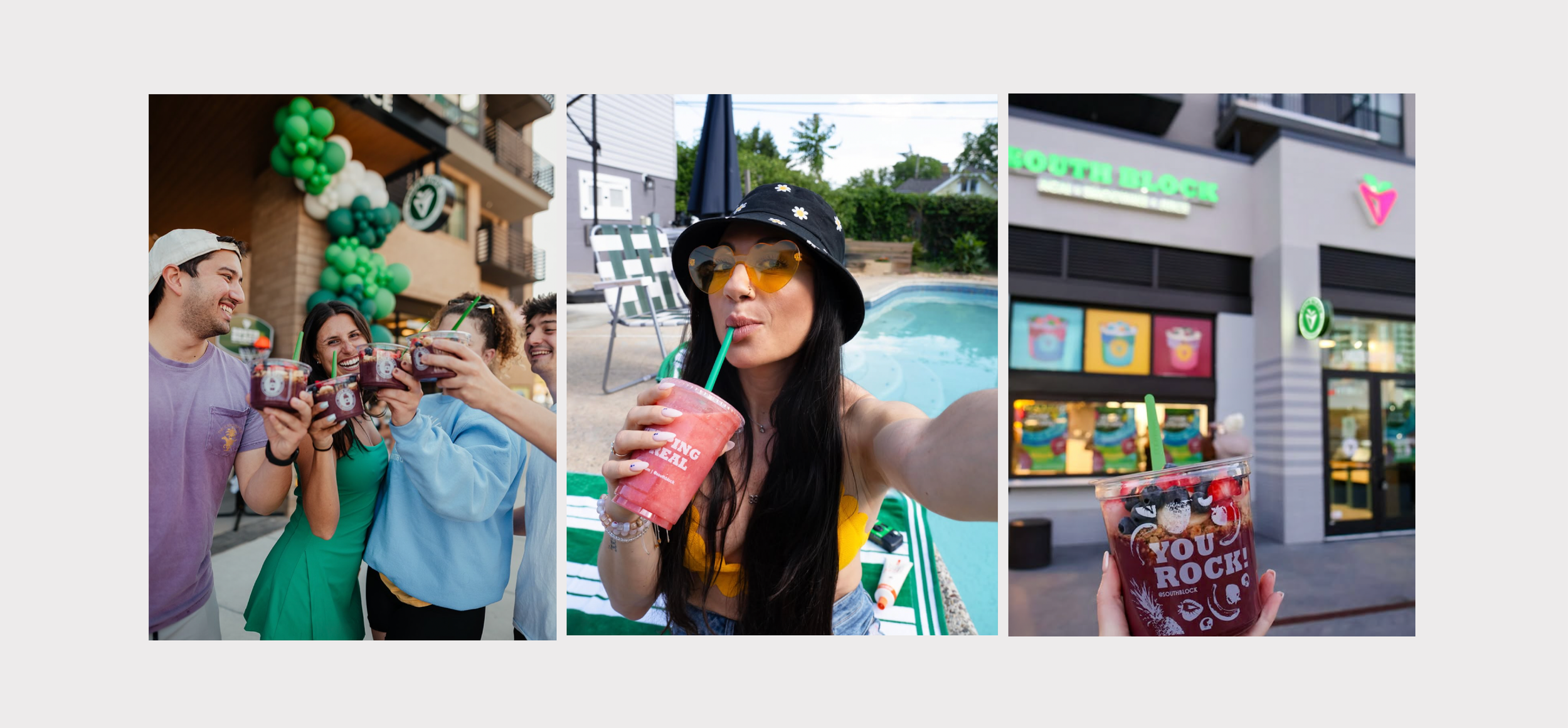
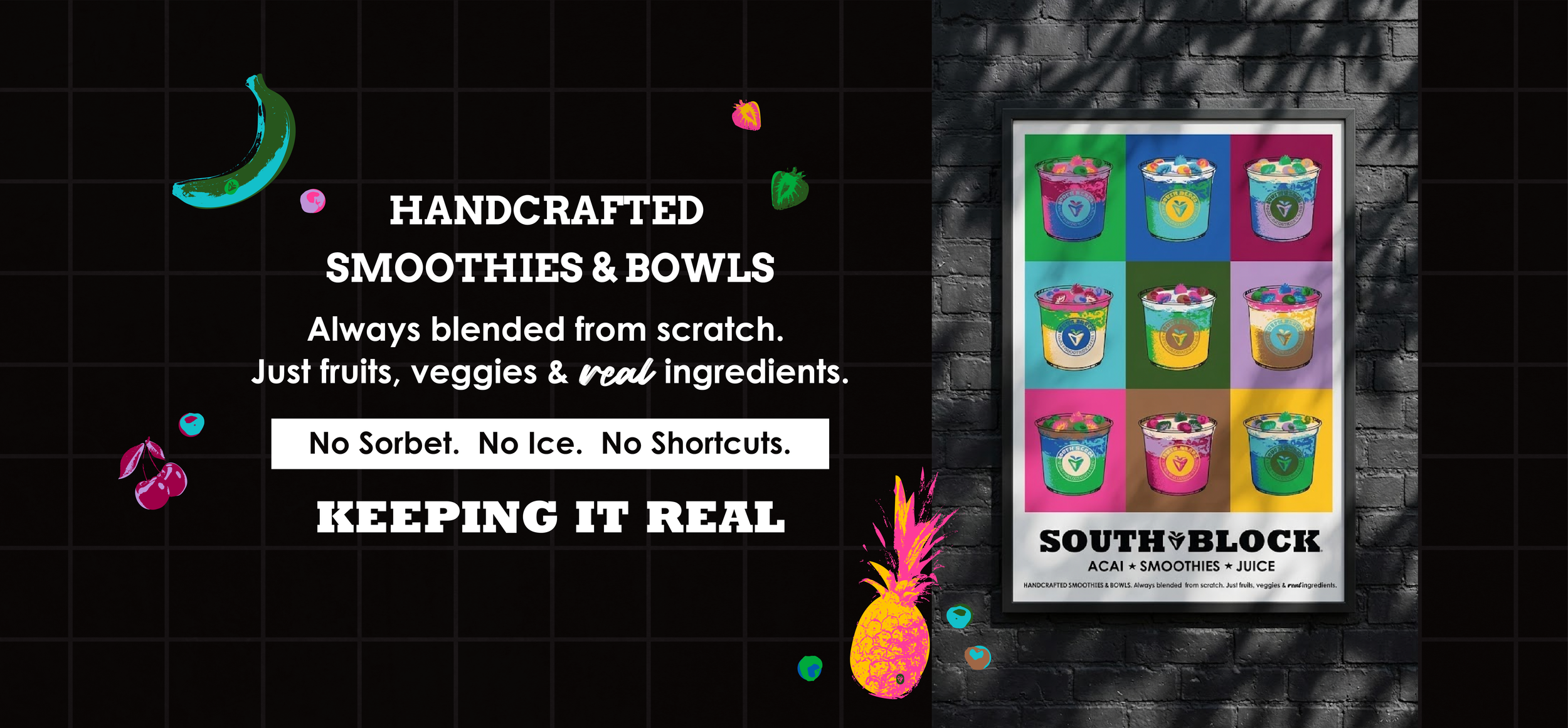
South Block is the QSR answer to clean eating done right: açaí bowls, smoothies, and superfood-packed bowls built for the health-conscious consumer who refuses to compromise on taste. With roots in the DMV and momentum across the Carolinas, South Block is riding the better-for-you wave with a menu that's as craveable as it is clean.
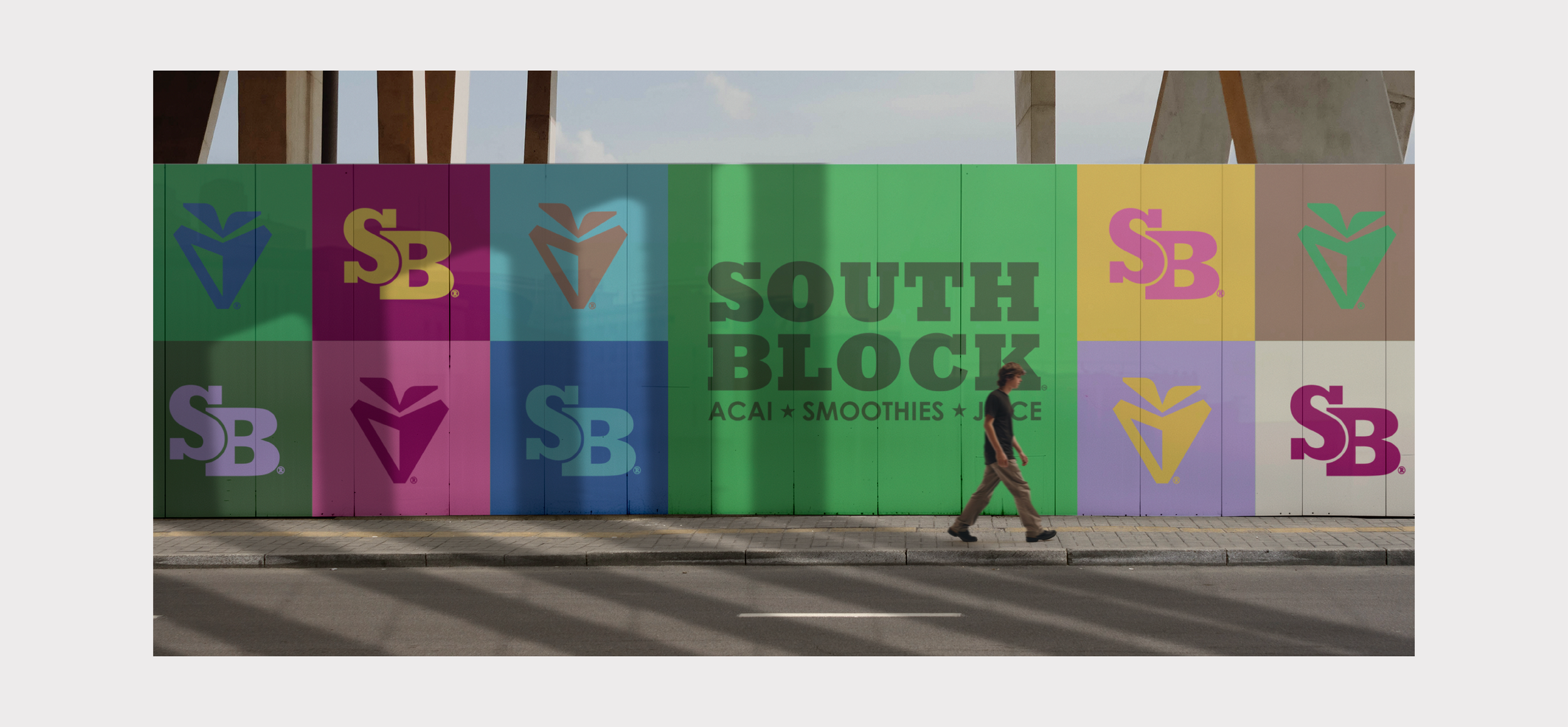
As South Block scaled, the brand it started with couldn't keep pace with where it was headed. Cameo stepped in to give the identity a whisper and the depth it needed — defining core values, brand pillars, and key demographics that turned "who we are" into something concrete. The result: clear guardrails that protect South Block's identity and culture as the brand expands into new markets, without losing the energy that made it worth expanding in the first place.
Project Collaboraters: Savory Fund
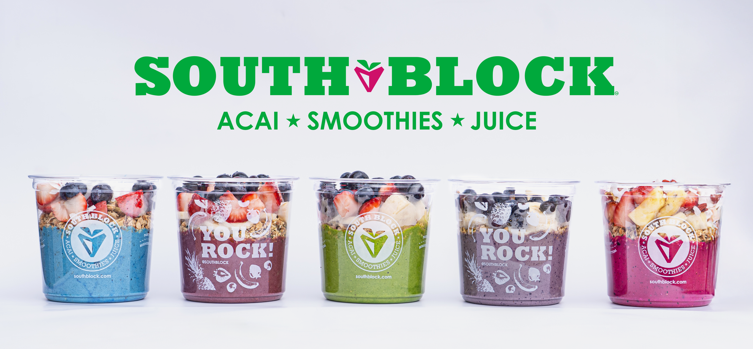
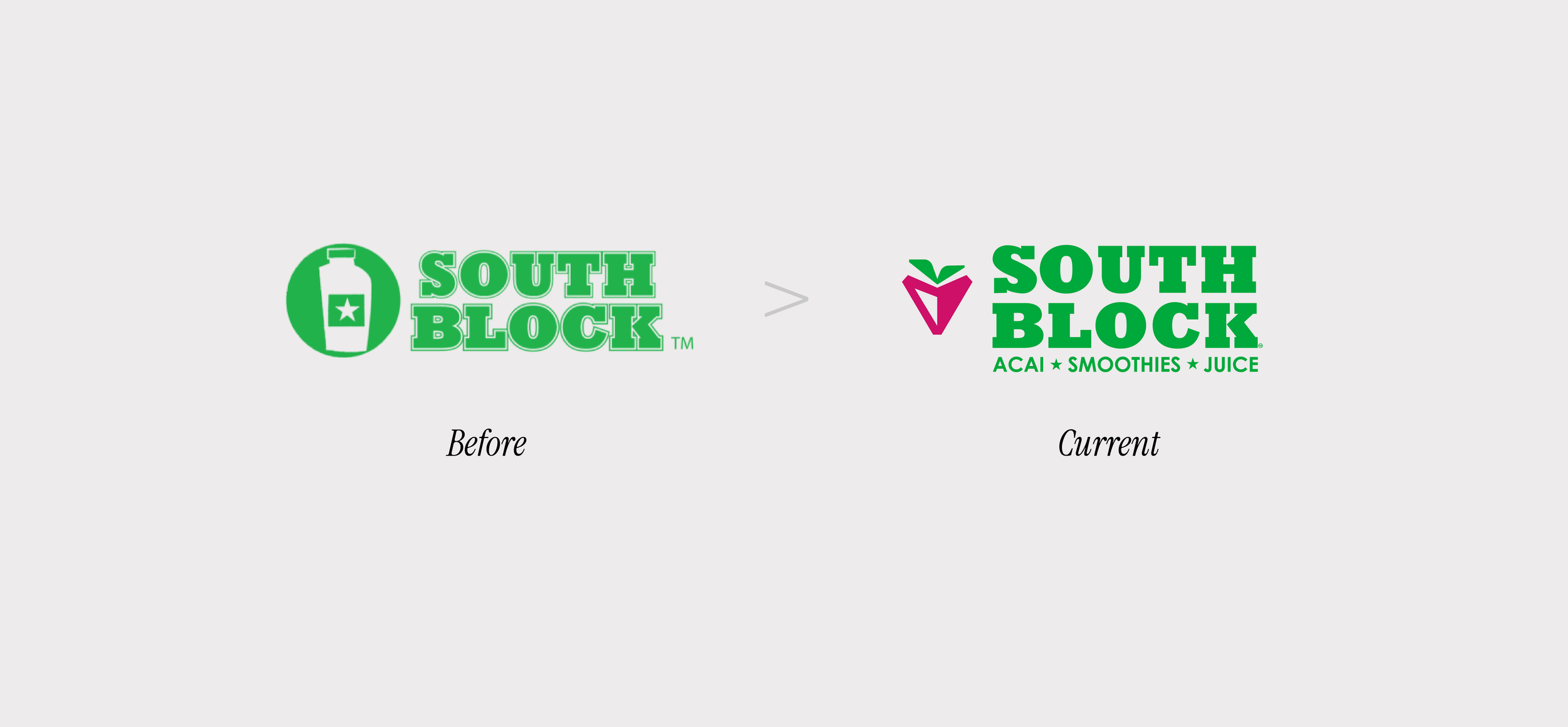
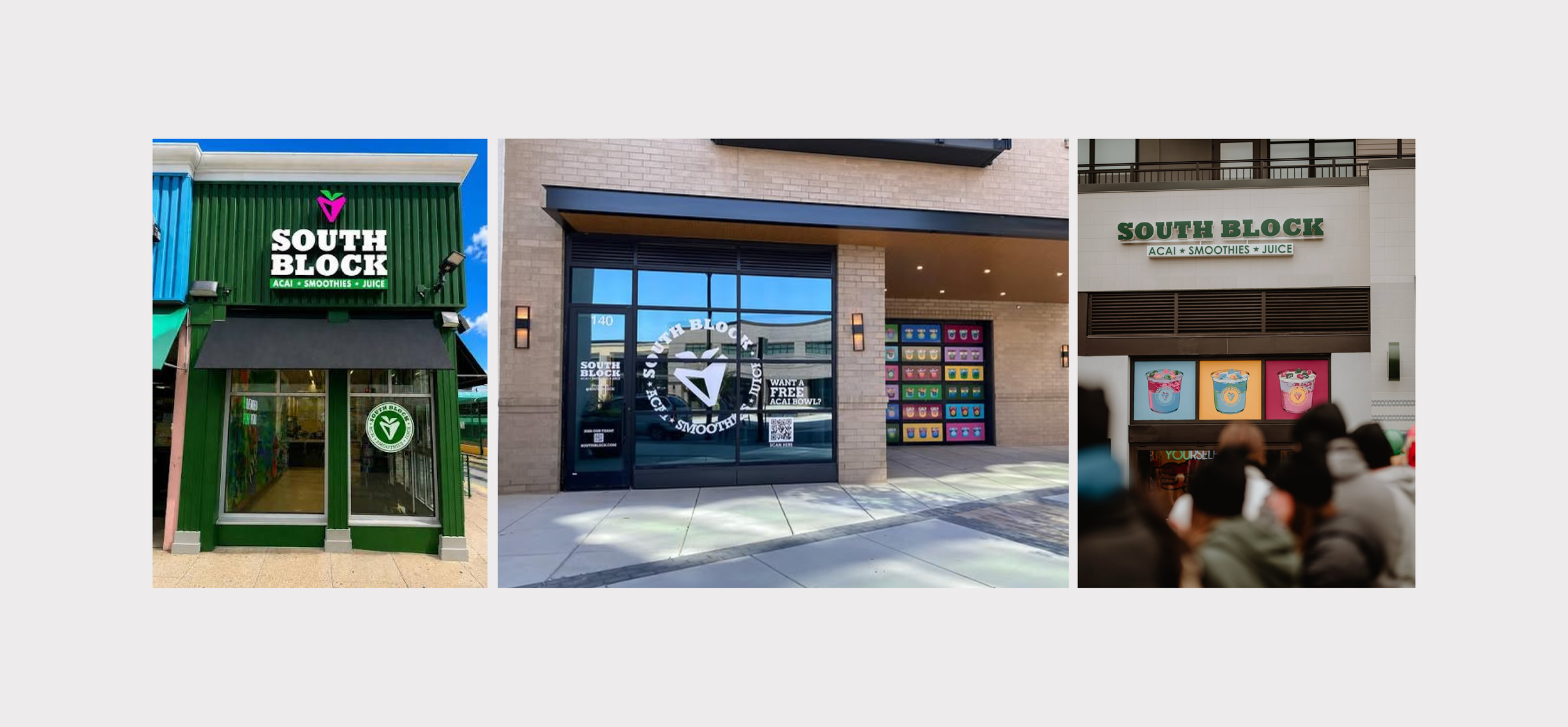
The goal was a logo whisper, not a redesign. Refining what already worked rather than starting over. We cleaned up the wordmark, removed unnecessary outlines, and fixed the tracking for better clarity at every size. The founder wanted to keep the bold slab serif, so we preserved that foundation while sharpening its legibility.
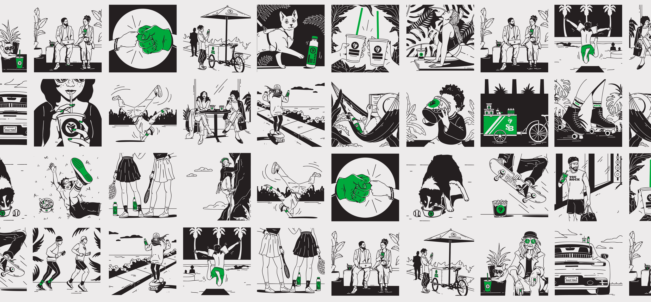
The original brandmark was a juice bottle. A strong visual, but one that boxed the brand into a single product category. We needed a mark that could grow with the menu, not limit it. The new symbol is a hybrid: a subtle nod to the product alongside a south-facing arrow, referencing the "South" in South Block while leaving room for the brand to expand its offerings without
visual constraints.
Since community is core to South Block's identity, the mark was also designed to double as a location marker. A small but intentional detail that reinforces South Block's connection to place, and the neighborhoods it serves.