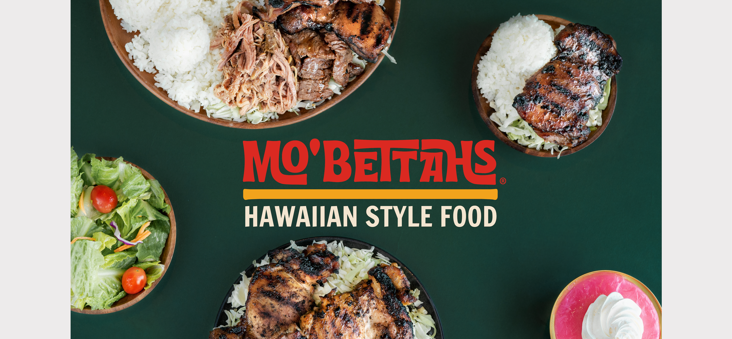
Mo’ Bettahs.
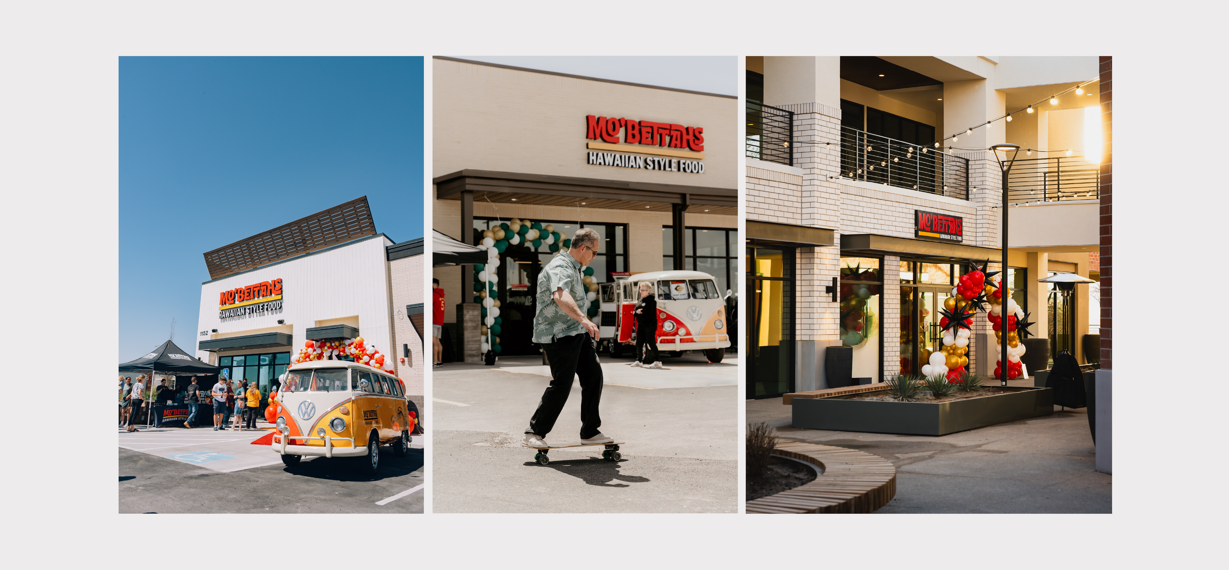
Mo' Bettahs brings the flavors of Hawaii to the heart of the mainland. Think teriyaki chicken, kalua pork, and island rice plates served fast, fresh, and with authentic aloha. With nearly 80 locations across nine states, Mo' Bettahs is proving that Hawaiian BBQ has serious staying power from coast to coast.
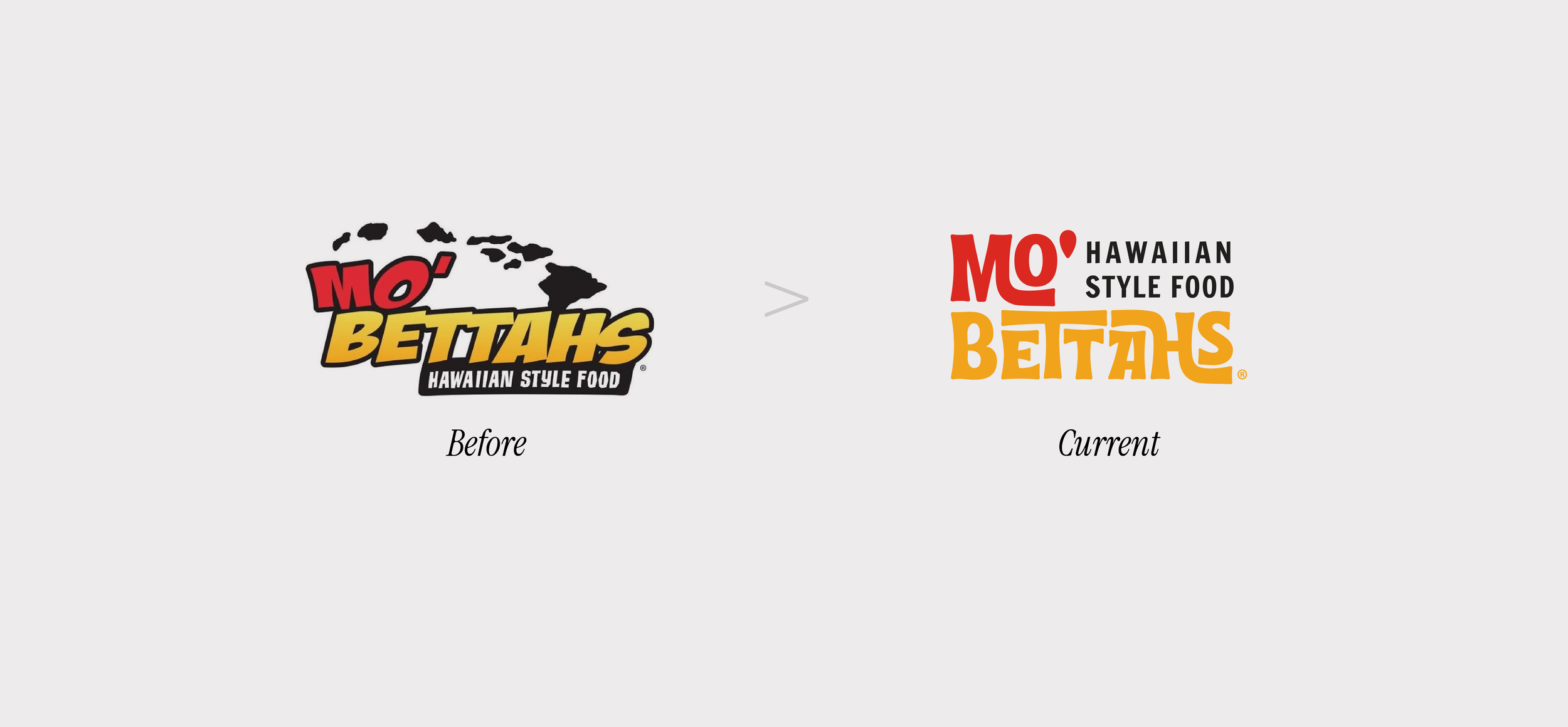
When it came to branding, Mo' Bettahs stood at a crossroads: a growing footprint, but a brand that hadn't caught up. The foundation was already strong with a clear strategy and set of values but the visuals hadn't caught up to match.
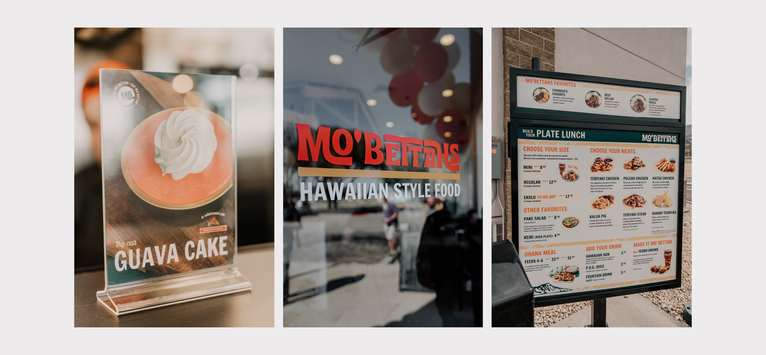
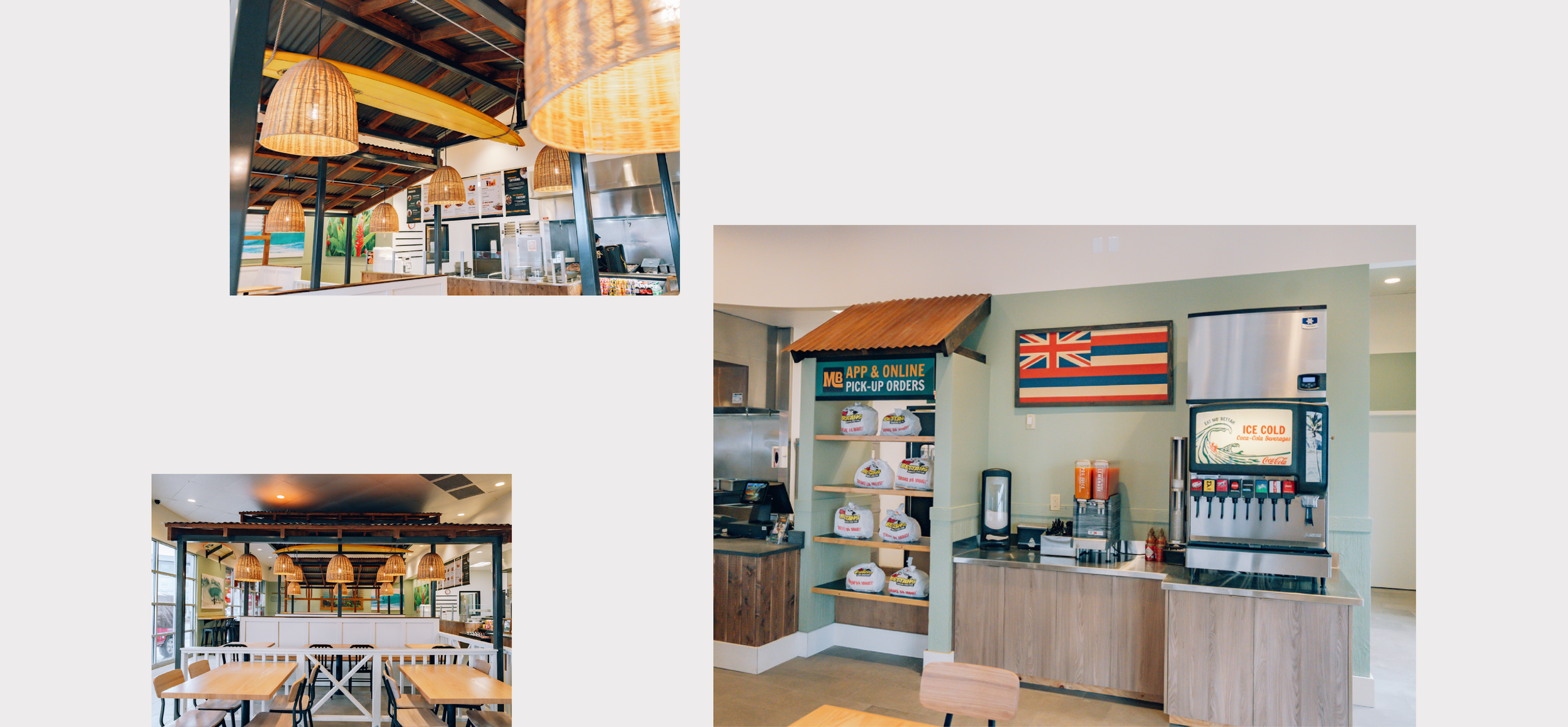
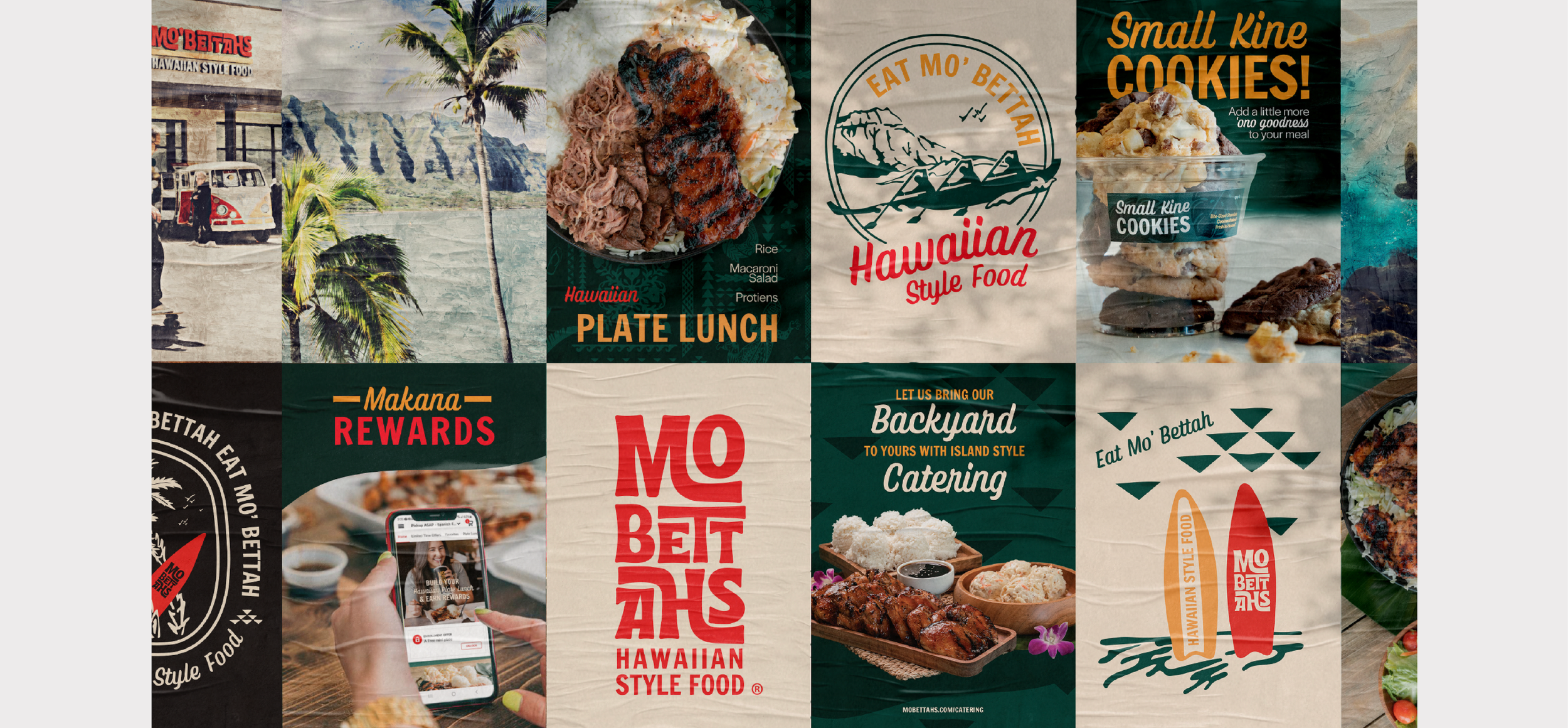
We started with a logo whisper, testing how far of a refresh we could take it. But it became clear Mo' Bettahs needed more than a polish, it needed a full rebuild. The result is a wordmark where the display type does the heavy lifting: flowing, island-inspired letterforms that capture the feeling of Hawaii without leaning on literal island imagery. No island outlines, no clichés, just type that moves the way the culture does.
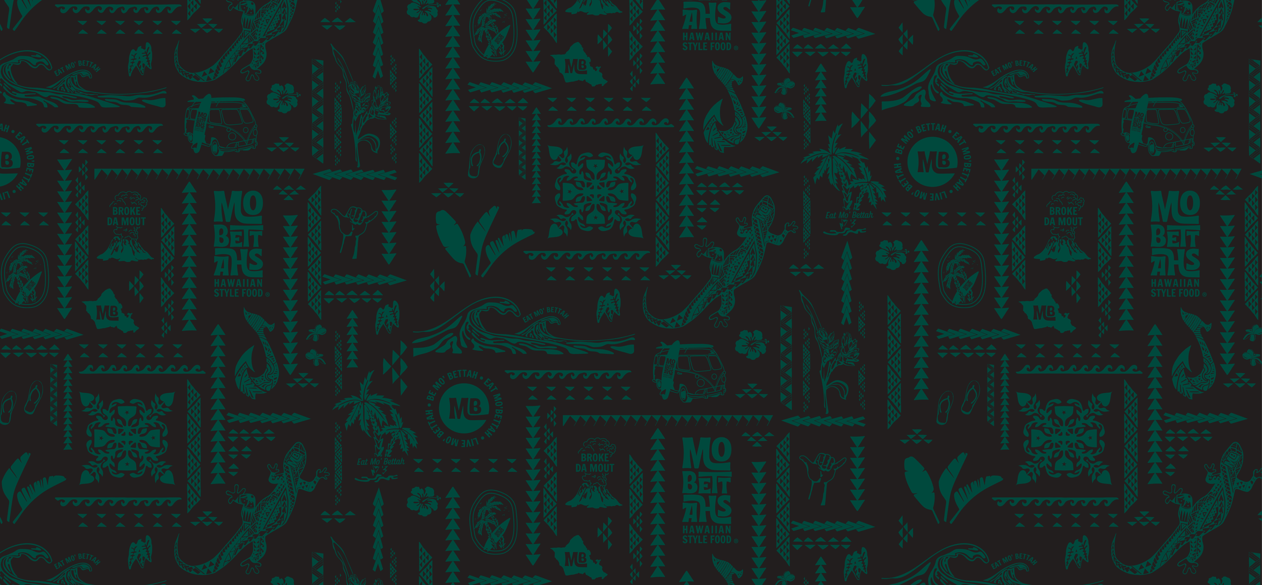
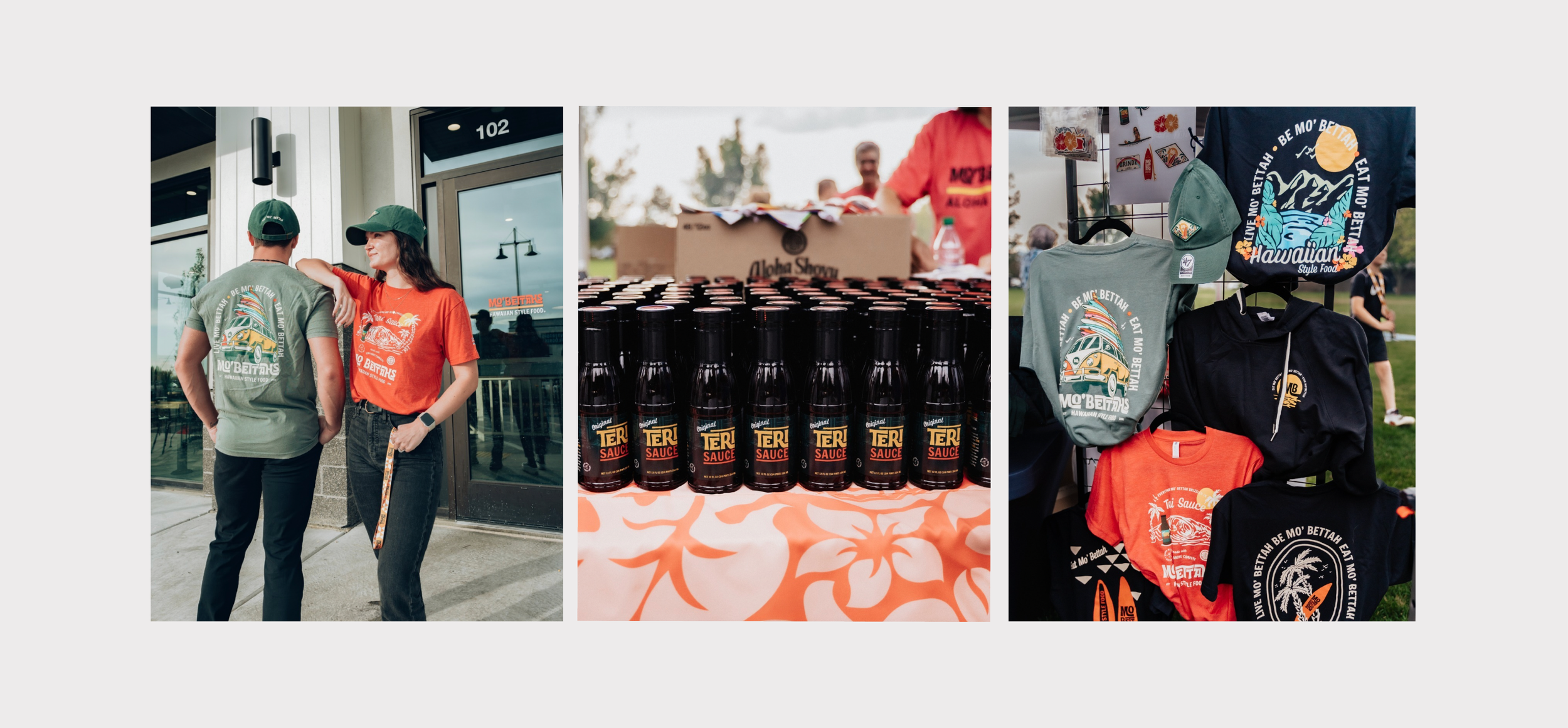
Every color carries meaning. Red represents Hawaii as a whole. Yellow honors Oahu — home to founders and brothers Kimo and Kalani Mack. Green nods to the lush landscape across the islands. Even the supporting graphics and patterns aren't decorative, each one is rooted in Hawaiian culture and tied back to the brand's values, so every visual detail says something true about where Mo' Bettahs comes from.
Project Collaboraters: Savory Fund